Erin Condren Life Planner Review Horizontal vs. Vertical
Any Erin Condren fans here? I've given away a few of these planners (another giveaway is coming up soon!). I did a review with my lame phone camera of Plum Paper vs. Erin Condren last year, and it's been a very popular post. Since I have a “real” camera now, I decided to review the new EC planners – one horizontal, and one vertical, for anyone who is on the fence about which planner to buy. We'll go over my opinions on the pros and cons of each type of planner in this post, and you'll want to stay tuned, because in a few weeks , I'll give away one of these planners! If you like one of these Erin Condren planners, you can use my referral link to get $10 off.
A quick overview – I have found that good planner is absolutely necessary for me to eat healthy, to keep a clean(ish) house, to keep track of appointments, and to homeschool my kids. When I've tried to do without a planner, I'm a disorganized mess. A planner has become one of my homeschool purchases along with our homeschool curriculum. I had tried many homeschool and teacher planners, but I really love the blank slate in the Erin Condren that allows me to plan lessons, keep track of meetings for work, AND track what I eat and plan our meals. It's an amazing organizational tool.
Let's get started! The planners pictured are ready to ship, which meant that they did not come with the customized cover. When you order these planners, you get a coupon code to order your special cover at a later date (and the available covers are amazingly beautiful). But I do not recommend buying a ready to ship planner, because I learned that they are not actually ready to ship. Mine went through the printing process and took just as long, if not longer, to arrive than a beautiful customized planner. So unless you're buying a gift for someone, I'd go with choosing a personalized cover instead.
These pictures are all different sizes, and for good reason: Some of them I wanted you to see more detail, so I made them bigger. 🙂 I know it messes up the uniformity and aesthetics of my page, but planner shopping is important business so I hope you'll let it go.
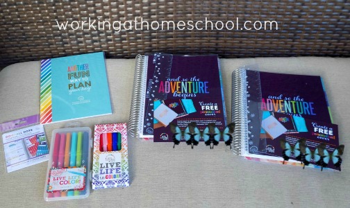
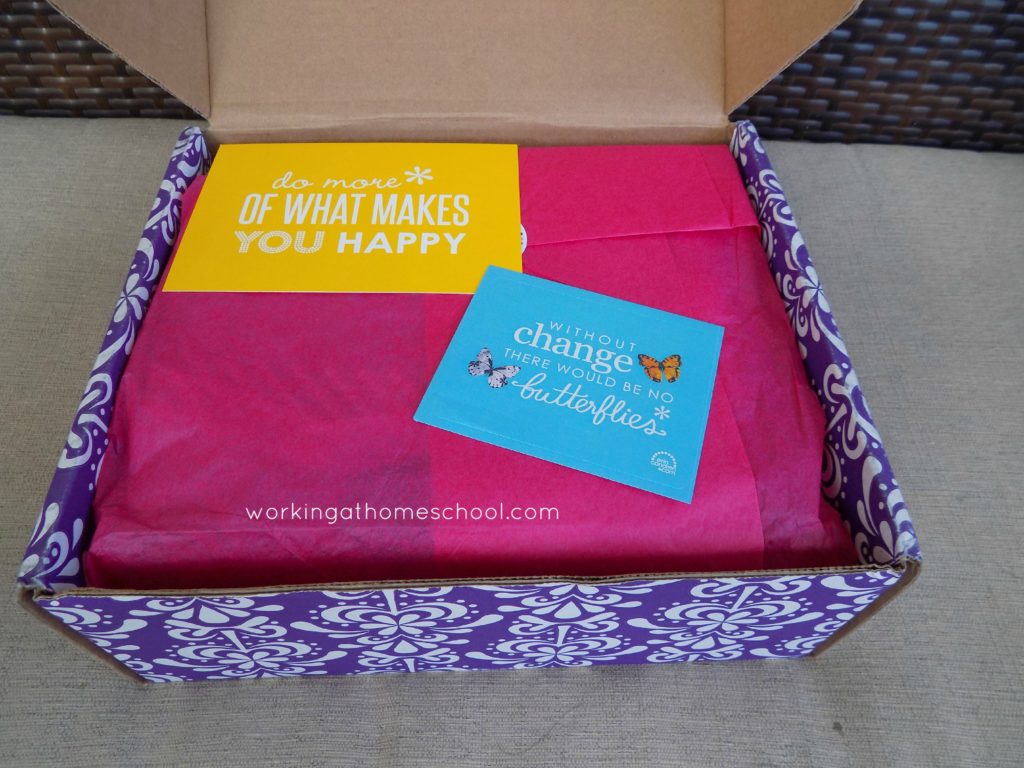
Pictured above is what I got when I opened my package. My very long-awaited package (sometimes Erin Condren planners take awhile to arrive) was so pretty that I opened it on my front porch. The butterfly graphics are covering my special code to order my customizable cover for these ready-to-ship-planners. These items are NOT automatically included in your order. I bought a bunch of extras, including the Classic stickers, do-it-all dots, old markers, new markers, and one horizontal planner and one vertical planner.
On the far left are “Do it all Dots”. Here's a picture of the opened package:
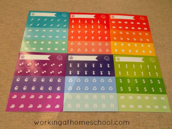
Next up is the “Classic Sticker Book.” I opened it up and pulled out the pages so that you can see what's included when you purchase this in addition to your planner:
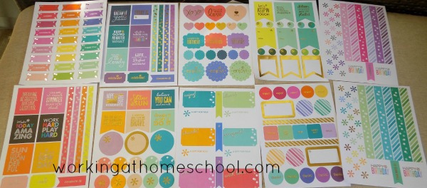
Below is the two sets of markers available now from ErinCondren.com. The top set is new, and comes in a hard plastic case. I love the case, and the colors, but I miss the purple available with the older set (pictured below).
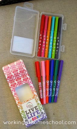
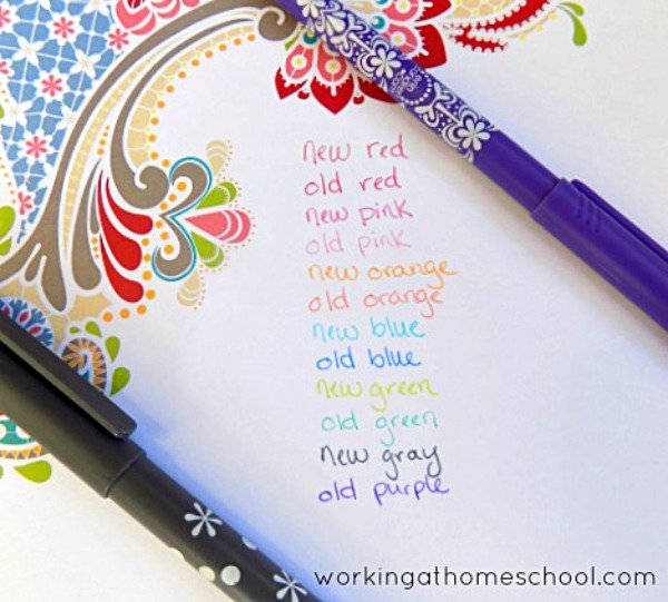
I did a writing comparison of the old and new markers for your viewing pleasure:
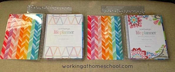
Now for the good stuff! Here are the 2015/2016 Erin Condren planners – the new horizontal layout is on the left, and the more traditional layout is on the right. These are 18-month planners, and they look identical until you open them up:
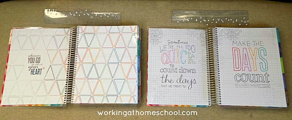
Below is the inside of the planners. While you can see that the covers for the ready-to-ship planners are the same, the first pages are very different – the horizontal planner has a triangle design, and the vertical has a pretty flower design. They both have a sturdy vellum sheet over the cover page, which is hard to take a picture of, but it definitely adds something to the planner.
Here is the first pages of the planners – as you can see, the horizontal has a triangle design, and the vertical has more text over graph paper.
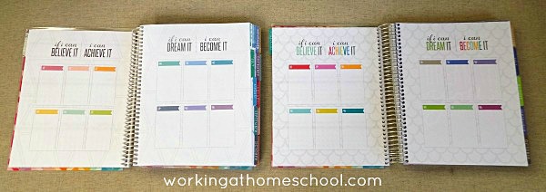
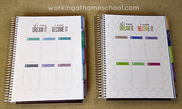
So I LOVE these new planning pages (below)! This is new to Erin Condren planners. There are twelve boxes, perfect for monthly planning, with “If I can believe it, I can achieve it, If I can dream it, I can become it”. The fonts are the same, but on the horizontal planner the text is black and on the vertical planner the text is more colorful. This also gives you a peek into the new color schemes for EC planners this year: the horizontal colors are beautiful! The vertical planner is over a fish scale-type background and in brighter jewel tones. I'm planning to use this page for monthly organization/cleaning tasks, master goals for homeschool, and weight loss goals. They are pretty roomy so I think I can fit it all in.
Next up is a picture of the yearly spread, followed by a closer shot:
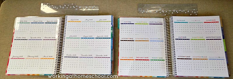
I still really, really love the font and colors on the horizontal planner. The font is cute on the vertical, but not my favorite.
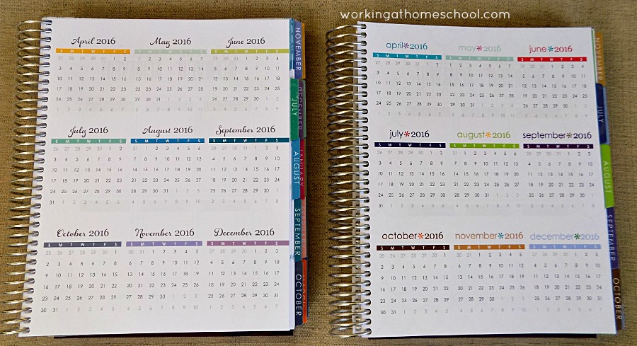
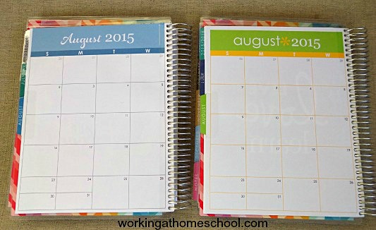
Below is the monthly spreads for Horizontal vs. Vertical. I think this is where you really start to see some differences. The horizontal planner has a muted color scheme and a beautiful cursive font. The vertical has a lowercase font with more design. Both have a box for notes on the far right side. Despite the fact that the pages look like they are different colors in this picture (why in the world is that?), they are all crisp and white.

Here is a closer view of one side of the monthly spread:
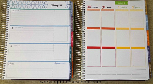
Now when you turn the page, you'll see this weekly spread, and where the new Erin Condren's get crazy. The left is the new horizontal layout, and the right is the more familiar vertical layout:

I am still so totally torn on which planner is the best. The horizontal has the prettiest font and colors, but the vertical planner is what I'm most used to. I love the list-making capabilities of the vertical layout. Both have space for notes and a “Thankful Thought.” The horizontal has a box at the right of each day for to-do lists, menus…the possibilities are endless. I REALLY like the lines in the horizontal boxes. But then I feel like there are so many horizontal planners out there…*sigh*. This is hard! Maybe I just need two planners. But I promised to give one away, so don't worry, I won't be keeping both. One of the great things about the new vertical planners (pictured right) is that the boxes used to be labeled, and now they are blank. So you can break your day into Morning, Day, and Night, or Before Work, After Work, and At Home…there are literally tons of ways to do this. For me, it would be most beneficial to use “Morning, Day, and Night” during the week, and then split the weekend boxes into jobs to be done, social activities, etc.
So that's pretty much the most important info about the new planners…except for the new note pages at the end of every month! I'm thrilled about this, because my Plum Paper planner had a note page at the end of each month, and I really missed the separation when I got an EC. Here's what they look like:

The colors are beautiful on both, but as I mentioned before, the vertical planner has more jewel-tones and the horizontal is more pastel.
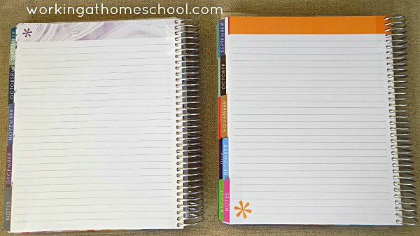
Below is the notes section at the end (which is pretty much my favorite). Lined pages:
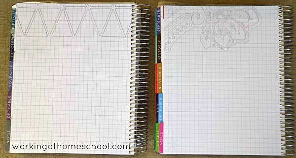
And new for this year…graph paper! Think of all of the interior designing I probably won't do with this. 🙂
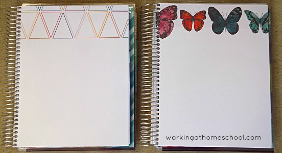
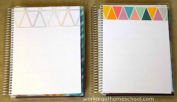
And finally, blank paper…I have to say that the vertical is much, much prettier than the horizontal on these blank pages, in my opinion. The horizontal pages all have a similar triangle design a the top, while the vertical pages have butterflies. I like that the vertical changes it up a little.
The note pages are followed by the next year's calendar…and then finally, the “Keep it Together” folder with a zip pouch full of goodies. 🙂 Mine came with a coil clip, compliment cards, a do-it-all dots sample, and a card explaining what everything is for. You'll want to check the EC website to see what's included with your purchase. I like the Keep it Together folder on the vertical planner better than the horizontal.

Hmmm…decisions, decisions. I don't know which to keep, and which to give away! Please don't forget to check in here – I'll be giving away one of these awesome Erin Condren life planners soon!
Which one do you like the best? Please let me know in the comments!
 Copyright secured by Digiprove © 2015


Never heard of these, they look wonderful, thanks!
I really really like the horizontal planner but I prefer the graphics and colors of the vertical, so I’m torn on which one to get!
I am in love with the horizontal! I live the colors, the font, the triangle pattern… just everything! I am really wanting one and just can’t decide if I should wait for the teacher planner to come out or just get it now… thanks for your review!
Love the horizontal fonts! That just sold me!
Love them both!
Both are beautiful, so tough to choose….I think if I had to pick it would be vertical because the colors are so cheery!!!!
Still love the vertical layout better! ☺
Still very in love with the vertical, and the simple changes are perfect!
I absolutely love the look of the horizontal one! I think it would definitely fit my style better!
I like the color scheme and font in the horizontal but have gotten used to the vertical layout. Your review has me leaning toward horizontal. Agh! Choices, choices. Thanks for the great pictures.
I love the layout of the horizontal but the colours and designs of the vertical is much prettier! Did the stuff in the keep it together pouch come with the planner because i don’t know if I am going to buy the coil clips and I want to know if you get one with the planner?
Yes, I got one coil clip free in he clear zip pouch!
Hai! I was just wondering if you’ve had a chance to test any of the ECLP vertical stickers (such as ones you can buy off Etsy) and test them in the horizontal layout? Do they fit too small? Too big? etc? Thanks for any insight you can give!
I just tested my batch of Etsy stickers from various stores to answer your question. It looks to me like the full-box stickers are just a hair too big, but it wasn’t a big enough deal for me to even want to trim them. I think it’s fine. Some things, like the long “weekend” stickers, don’t work in the horizontal planner.
dang you’re fast.. thanks so much for the answer so quickly. This is my first ECLP (I still have yet to receive it actually) But, i wanted to know if i was grossly limited to the few ‘horizontal’ stickers that are available or if I was free to go bonkers on the normal ones. Thanks so much for the update! :))
I am torn as well!! I just feel like if I get the horizontal I will miss the vertical layout I’m used to and I love the keep it together such in the vertical!!
I did end up deciding on the horizontal, and I’m still getting used to it, but so far I LOVE it! I’m going to start sharing pics on Instagram, but I’m basically keeping the far right blank box for meal planning, and I LOVE the lines! I broke my horizontal box into thirds – the first is appointments/daily schedule, the second is my to-do list, and the third is for meal planning. I’m glad I tried it out! I may go back to vertical at some point, but for now, I’m stuck with this for 18 months, lol.
Hi
I love this review. I’ve been looking for a review which actually shows the different planner layouts side-by-side.
Thanks so much for this!
K
I love the option of horizontal but I like the colors and font better in the vertical layout. Which are you using?
I went with the horizontal, and so far I like it! But it is hard to get used to. I’m segmenting the horizontal boxes, which makes it easier for me. I’m your opposite, I guess – I love the fonts and colors on the horizontal, which made me go for that one.
Does the weekly view of the vertical layout have lines? I LOVE vertical planners, and I love the style of the EC in vertical… but I have to have lines or my writing will be all crooked!!
It doesn’t. 🙁 I actually tried switching back to vertical this month because I miss the vertical layout, but it doesn’t have lines, so I’m going back to horizontal again. The lines make a big difference!
Thank you so much for your side by side comparison of the two Erin Condren layouts! I’m so confused still, but feel better looking at them together! I do know I don’t one the hourly one, but that is as far as i can narrow things at this point.
Thanks again!
Becca
Sure, thanks Becca! I’ve been considering doing a review of the hourly one, but I’m really not interested in it so I just don’t know if I should! I’ve gotten really used to the horizontal layout, and I really enjoy it, but I’m starting to feel like I was more productive with the vertical, so I’m considering switching back. I really LOVE the colors in the horizontal, though.
I need a planner to actually write in..not these phone apps…
Love the colors in the vertical.
Thanks for all the details! I am trying to decide on a planner. I’ve never bought an EC because I’m…um, just too cheap! 🙂 I usually end up printing my own, which is a pain, or using one that just doesn’t quite fit me. I really liked seeing the page layouts. I actually like the bright colors on the vertical layout best, but the horizontal arrangement appeals to me a lot. I don’t think I’ve ever tried a horizontal configuration–trying to decide whether it would work better or not. But jewel tones and butterflies are so much more Me. Decisions, decisions!
It’s so hard…and honestly, the colors were a big factor in my decision. I have liked the horizontal, but I’m pretty sure I’m switching back to vertical for 2016. I figure it’s less than $5 a month to buy a planner that lasts all year…but then I had to justify the expense somehow because I wanted one SO BADLY, lol.
Loved getting to look at these side by side! I am waiting on my EC planner to arrive. I am so excited!
That is one of the most fun pieces of mail to receive! I’d love to hear how you like it!
I like the erin condren vertical planner. I wish i could get it this year. But it is to much money
It is expensive. When I got my first one, I gave my husband the $10 off coupon code so it was only $40 and asked for it for my birthday.
I should have found this blog before I ordered mine!! I just got the horizontal for a change, as I usually get the vertical layout. I’m REALLY torn. I love the muted colors and fonts. I HATE HATE HATE the triangles. So ugly and so specific!! She has a few geometric covers that I avoid like the plague, so to receive this and open it up and find it’s full or triangles… mortifying!!! (I know this might sound a tad dramatic…) It’s not even a style thing, just the sharp edges of geometric designs drive me crazy–loud and edgy, etc. Ugh. Not sure what to do.
I know what you mean! I have started covering the triangles with washi tape. I was OK with them at first, but I’m also not a fan of the geometric prints.
Love the vertical layout better!!!
Me too! I tried horizontal for awhile, but I ended up sticking with vertical.
I have the horizontal and feel link you have to use more imagination with it. But how come they Etsy stores cater towards the vertical planners with their stickers. It’s like their sticker and kits are endless but the horizontals don’t have very many cute stickers out there and totally limited…I may have to get a vertical next year just for the sake of getting cuter stickers.
I’m totally with you on that one! You’d think there would be more Etsy sellers doing horizontal stickers! It just doesn’t look as cute without decoration.
Hello,
Does the horizontal planner have more room to write in the daily weekly section then the vertical? I need lots of space to write on each day in the weekly section. Also, I am looking for a to-do list that I would see every day. Where would I put that in the book? I wanted it to be in the weekly/ daily section but it doesn’t look like there is enough space for that.
Thanks for the help.
It does have a bit more room than the vertical. When I used the EC dashboard, I used one of their dry erase snap-in dashboard. My favorite planner with a To-Do List is Emily Ley’s Simplified Planner, but it doesn’t have a weekly spread – it’s one page per day. You can check out my review here if you want to see pictures.